


VibeUp is created by me. It is a mental health app that offers a comprehensive range of features, including information on various diagnoses, self-care workshops, mood dashboards, and journaling, all designed to cater to the needs of individuals.
VibeUp
Overview
Challenge
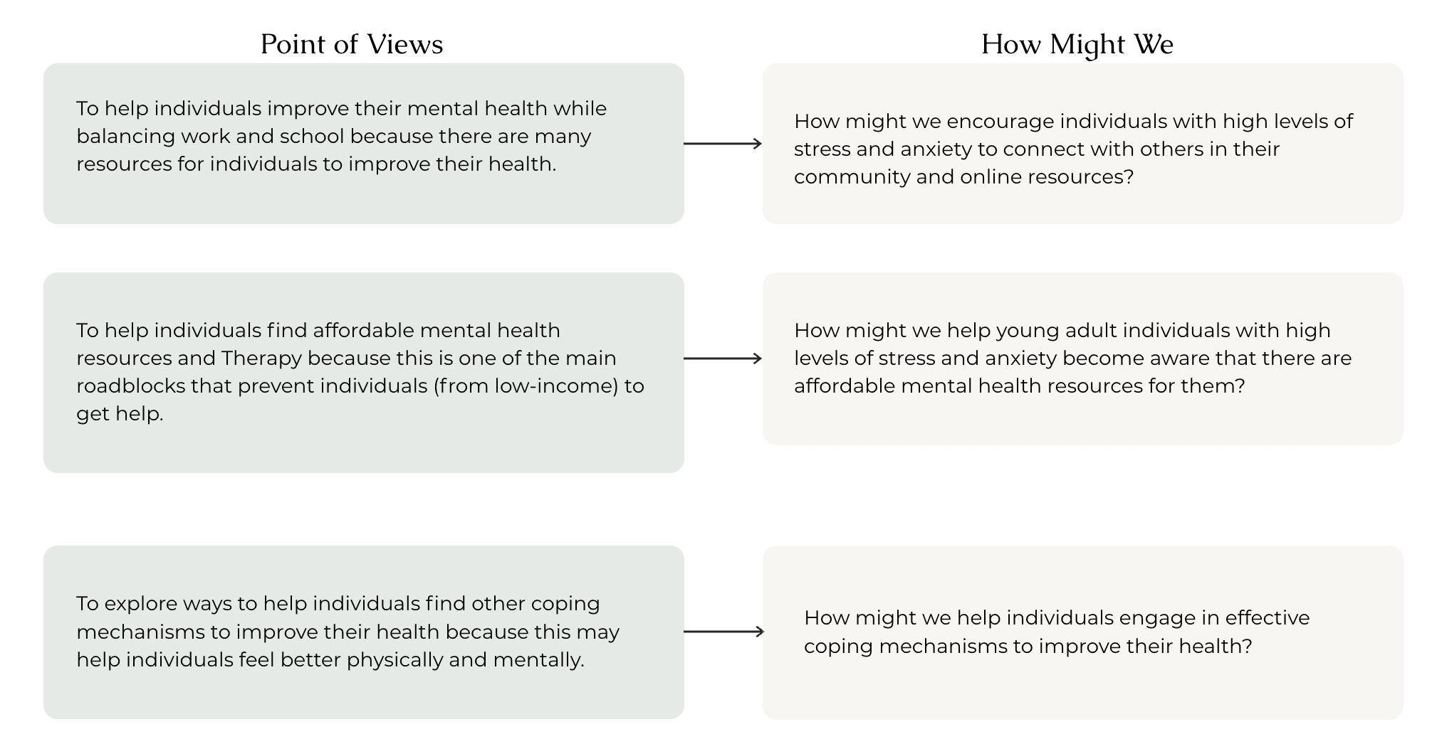
How might we encourage individuals with high levels of stress and anxiety to connect with others in their community and online resources?
Time: 4 weeks
Tools: Figma and Photoshop
Role: UX Designer
Solution
I’d like to explore ways to help individuals find other coping mechanisms to improve their health because this may help individuals feel better physically and mentally.
Primary Research
The first crucial step in my journey was to educate myself thoroughly on the prevailing trends and the demographic landscape of the mental health market. Through extensive research and analysis, I uncovered several significant insights:

Competitive Research
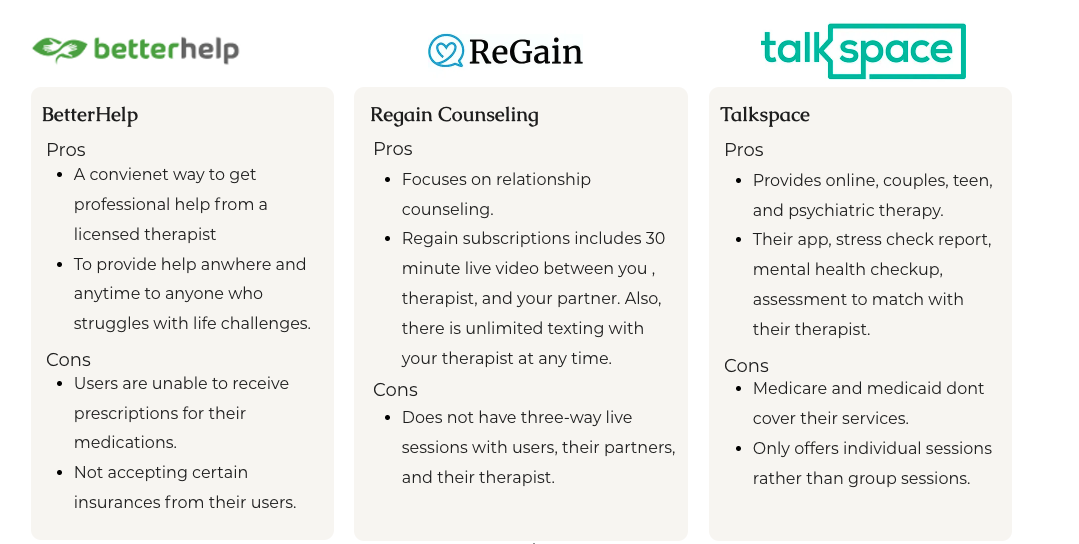
In this phase of the project, I dedicated my attention to exploring various mental health apps and conducting a thorough analysis of their key features and identified challenges. During my research, I came across three companies that offer therapy sessions and self-care workshops. However, I noticed that these apps do not provide free resources to individuals. Below are the pros and cons of three companies.
User Interviews
Through the interviews conducted, participants shared a strong motivation to enhance their overall well-being. They aspire to proactively take charge of their personal growth. It was observed that some participants expressed concerns about their parents harboring stigmas surrounding mental health, yet they displayed a resolute determination to seek out mental health resources that aid in their physical and mental improvement.
Nevertheless, four common pain points emerged during the interviews:
Financial constraints posed a significant challenge.
Balancing work or school responsibilities proved to be demanding.
The cultural context exerted a substantial influence on the participants' lives.
Despite these challenges, a majority of the participants reported having a supportive circle of friends who are willing to lend an empathetic ear and provide assistance whenever needed.
Interview Keypoints
Most likely,
Users want to be able to find free mental health resources and not feel like they have to pay out of pocket for them.
Users will more likely not seek help if insurance isn't covered for them.
Users want mental health information such as types of mental health illnesses, why it is important to take care of your health, etc.
Affinity Map
Once the interviews were concluded, I assigned 8 colors per interviewee, and then grouped them by similar categories that I picked out during the interviews.
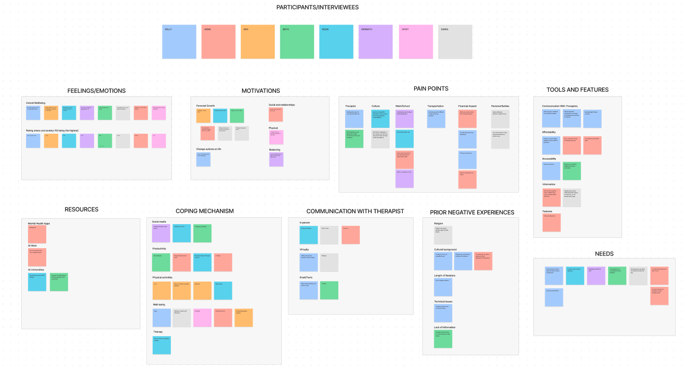
Insights:
Locating affordable or free mental health resources can be a challenging endeavor.
Users seek therapists who can truly connect with their unique experiences.
Users have voiced their frustrations when they encounter obstacles in accessing the assistance they require.
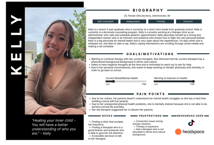
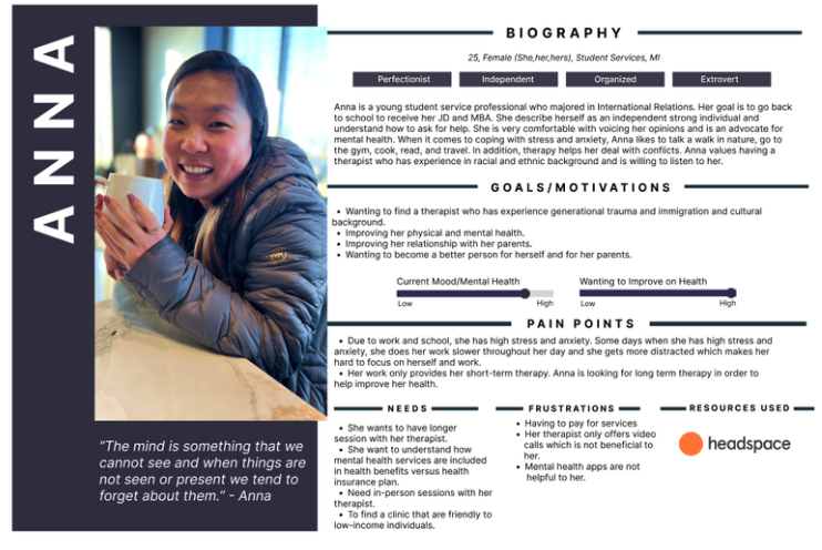
User Personas
I wanted to gain a better understanding of my targeted users. I conducted interviews with people who want to improve their health and those who liked to explore ways how to become a better version of themselves. Based on the information I've gathered, I built personas that differ from each other: Anna and Kelly.
Why are they important?
Help make informed decisions.
Empathize users' needs and pain points
Common Theme:
Wanting to seek help are not sure where to look.
Why did I choose Kelly and Anna as my personas?
Express and focus on the major needs and pain points.
Kelly is a college student who is consistently in need to find a new therapist that understands her cultural background.
not busy.
doesn't have the finance to seek therapy.
Anna is a student service worker who struggles to find time to seek mental health.
Have the finance to seek therapy but am not sure where.
Doesn't have time for therapy.
POV and HMW
After completing my user interviews, I specifically picked out users’ pain points that are similar to each others. This is what I came up with:
Site Map
I built the site map to help me figure out the foundational layout for my design.

Road Map
I created a roadmap that outlines the direction and goals of based on the participants’ experiences. It serves as a guiding foundation for me to move onto the next steps.

User Flow
These diagrams are an important role in informing my design decision by showing me step by step of each task. By using the user flow diagram, I gained in-depth insight into creating a friendlier user interaction. This enabled me to use strategic skills and focus on what to prioritize (such as the user's pain points and needs) in order to create a positive user experience.
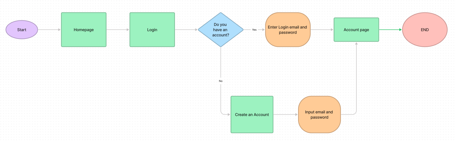
User Flow 1: Logging into the homepage.

User Flow 2: Finding a local therapist near them.

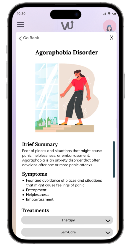
User Flow 3: Finding a specific anxiety disorder called Agoraphobia.
I created a visual representation of the steps a user take to complete a specific task or to achieve a particular goal. After completing my research and user interviews, I was able to identify users pain points, optimize user experiences by reducing number of steps, and understanding the users behavior (how users navigate through an app).

User Task Flow
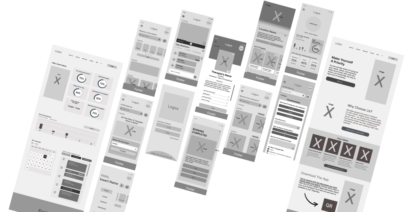
Low-Fidelity Wireframes
To better my understanding of the desktop and mobile layout on all screens, I started creating low-fidelity wireframes.
These wireframe creations served as a foundation for the product design. This gives me the opportunity to explore different possibilities to figure out which layout suits best for users. By arranging the elements around, I was able to evaluate the overall composition of my design.
UI Kits and Brand Identity
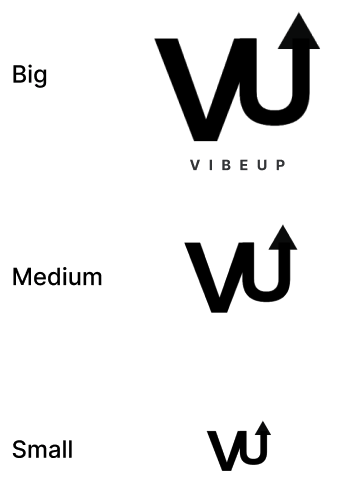
The brand name, VibeUp, encapsulates the powerful message of "It is okay to not be okay." It serves as a reminder for users to embrace the inevitability of life's challenges that are beyond our control. In such moments, the brand emphasizes the transformative power of cultivating positive vibes to uplift one's mood and energy.
When envisioning the brand logo, my goal is to create a visual representation that embodies the essence of VibeUp. The logo should capture the essence of the brand name itself, portraying a sense of positivity and resilience in the face of adversity.
LOGO
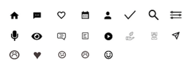
ICONS
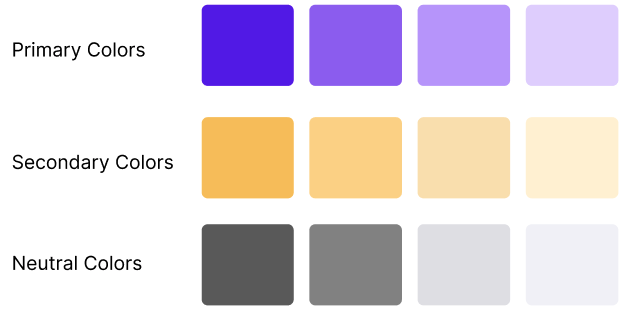
COLORS
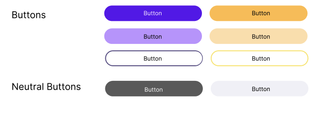
BUTTONS
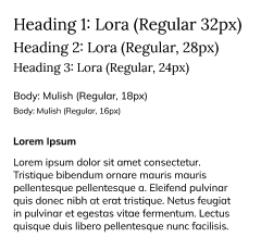
TYPOGRAPHY

CALENDAR BUTTONS
With the help of Figma, I transformed my initial wireframes into captivating high-fidelity designs, giving my project a sense of realism.
Throughout the design process, I prioritized addressing key challenges to enhance user experience, including:
Minimizing clutter: I ensured a clean and intuitive interface.
Ensuring consistency: I aimed to create a seamless experience across the entire product.
Avoiding overwhelming users: I crafted a design that exudes tranquility and reassurance, fostering a sense of calmness during interactions.
To further refine the usability of the design, I plan to conduct thorough usability testing. I aim to uncover any potential areas of improvement and refine the design based on valuable user feedback.
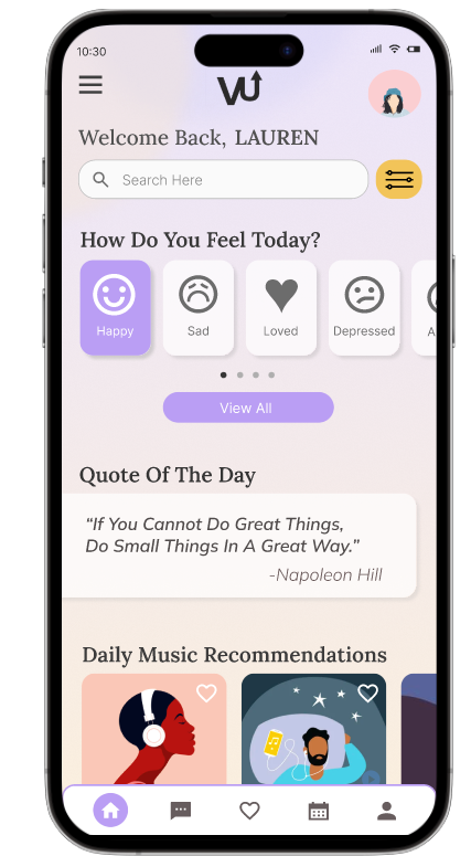
High-fidelity Wireframes
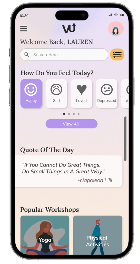
Logging into the Vibeup app


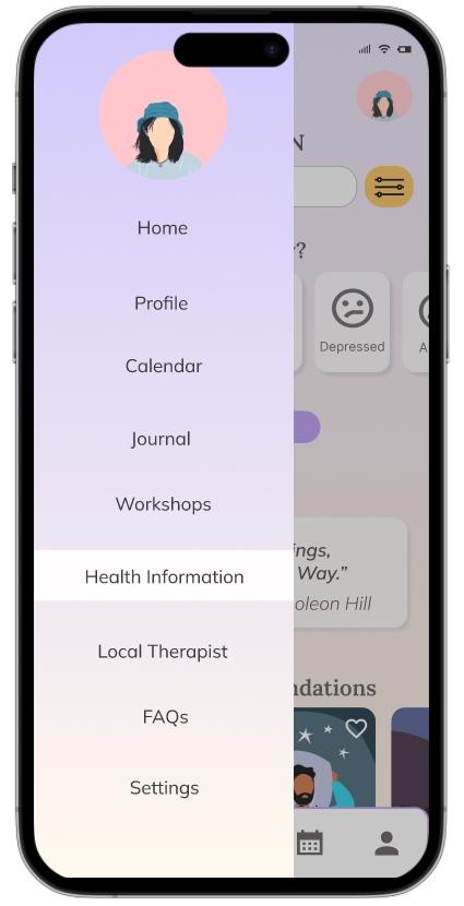
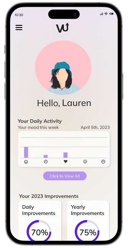
Accessing your Vibeup profile
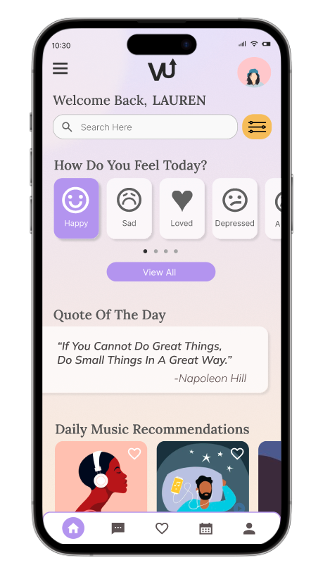
Users are empowered with the ability to track their mood, allowing them to gain valuable insights into their emotional well-being and monitor their progress over time. This feature provides a user-friendly interface where individuals can record and analyze their emotions, helping them develop a deeper understanding of how various factors affect their mood. With the mood tracking functionality, users can create a comprehensive log of their feelings, attaching relevant notes, timestamps, or even images to each entry.
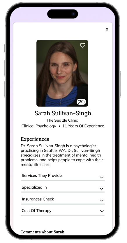
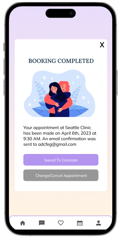
Process of booking an appointment with a therapist based on your Questionnaires
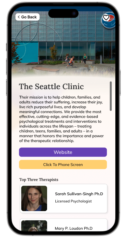


Vibeup provides mental health informations


To conduct usability testing, I reached out to 6 participants to complete the test. During the test, I asked participants to complete the following tasks:
Logging in to find the yoga meditation workshop video.
Creating an account.
Booking a therapy appointment.
Finding a specific anxiety disorder called Agoraphobia.
Usability Testing
Results
3/5 participants ran into no errors.
5/5 participants completed all four task flows.
5/5 participants are willing to download the app and recommend the app to their peers.
Iterations
Based on the result of the testing, the overall changes that need to be made is below.
1. Add a successful face ID screen to make sure face ID works.
2. Add some menu options on the homepage since some people don’t know what the menu button looks like.
3. Dr. Sullivan-Singh might need to be capitalized because it says “Sullivan-singh.”
4. Change typo on the questionnaire screen to “Why are you considering therapy?” not “What are you considering therapy?”
5. Add a phone screening screen before the Seattle clinic information screen.
Iterations:
Add a successful face ID screen to make sure face ID works.
Why?
Some users reported that after swiping up to log in with FaceID they weren't sure if the face ID worked. They suggested adding a screen that says, "Face ID worked."
Usability Testing Iterations

Iterations:
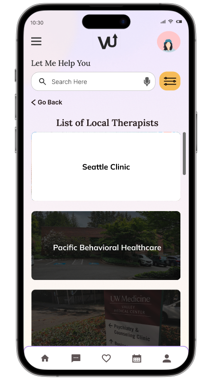
Add lists of local therapy clinics near users.
Why?
Some users reported that it's better to have a generated list of therapy clinics than to generate only one clinic that best suits them. This way it gives users the opportunity to research which clinics are better for them.
Iterations:
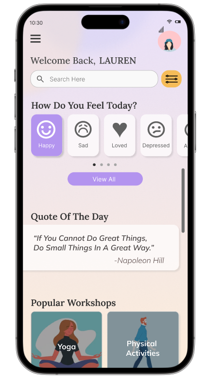
Add some menu options on the homepage since some people don’t know what the menu button looks like.
Why?
Some users have trouble knowing where to click. Some click on the search bar and some clicked on the menu bar. One user suggested adding a view important topics to the homepage such as workshops and mental health information.
Before
After
Final Prototype
What worked and what didn’t?
When it comes to accessing mental health support, users expressed a strong desire for affordable and freely available resources, as the cost of therapy continues to rise. This financial burden left many feeling frustrated and unable to access the help they needed.
By delving into the user profiles and understanding the root causes of their frustrations, I developed a mental health app designed to swiftly connect individuals with pertinent information and facilitate easy appointment scheduling with nearby therapists.
This culmination of our research and rigorous usability testing has resulted in the creation of the final prototype, delivering a solution that meets the critical needs of our users.

Reflection
Working on this app holds great sentimental value for me and has been an invaluable learning experience. My primary objective was to enhance the overall user experience by optimizing the design elements that resonate and have a profound impact on users.
Throughout this project, I have gained several insights into creating my design:
I have learned the significance of generating feature ideas and conducting research and interviews for mental health resources. Moving forward, I intend to focus more on formulating better research questions that will lead to superior end results.
I have learned the importance of ensuring accessibility in my designs to cater to all users.
I have realized that user testing is an ongoing process that extends beyond development. Designs inevitably evolve, and it is crucial to iterate and refine them accordingly.
Changes I would like to implement includes:
Expanding the reach of my interviews to include a wider range of individuals.
Engaging with individuals aged 30 and above, as well as those between the ages of 12 and 18.
Overall, there is still work that remains to be completed on this app. I am deeply committed to improving my research skills and conducting interviews based on my experiences and knowledge thus far. This project has provided me with a deeper understanding of the relationship between human behavior, interaction, and design. By comprehending these relationships, my aim was to deliver impactful designs that align with the needs of users.